With a non-user-friendly interface and poor user experience, Jollibee’s customers are uninstalling the app and opting to order in person. This shift not only results in crowded locations but also leads to a loss of valuable online user data.
I optimized the app’s information architecture, seamlessly integrating content from both the Jollibee website and the app. This streamlined the process from menu browsing to payment, speeding up the ordering experience. By enhancing the interface design and improving the overall user experience, it can boost user engagement and loyalty, helping Jollibee regain and retain its customer base.
I love Jollibee.
However, the process of ordering food and picking it up can often be quite frustrating. To use a $5 coupon, I decided to order through the Jollibee app. It took me 15 minutes to complete my order because I had to go back and forth. If I close the app and reopen it, I have to re-enter the postal code to set my location again. Additionally, with only a single payment option available, I had to find my credit card and manually input the information. This sparked an idea: How can I make this app feel more intuitive and effortless to use?
Of course, if I were designing the actual product, I would also refer to the company's roadmap and more comprehensive business insights to ensure that the redesign aligns with both user needs and business goals. Since this project is a personal exercise, the design decisions are based on my own user research and limited available information about Jollibee's business strategy.
As a designer, I know I shouldn't rely on my own assumptions when defining user needs. I can't simply assume that a problem is common enough to warrant a solution. To quickly validate whether this issue was worth addressing, I decided to:
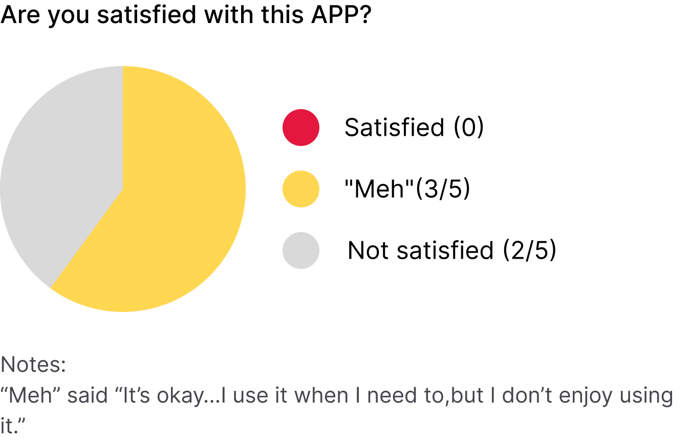
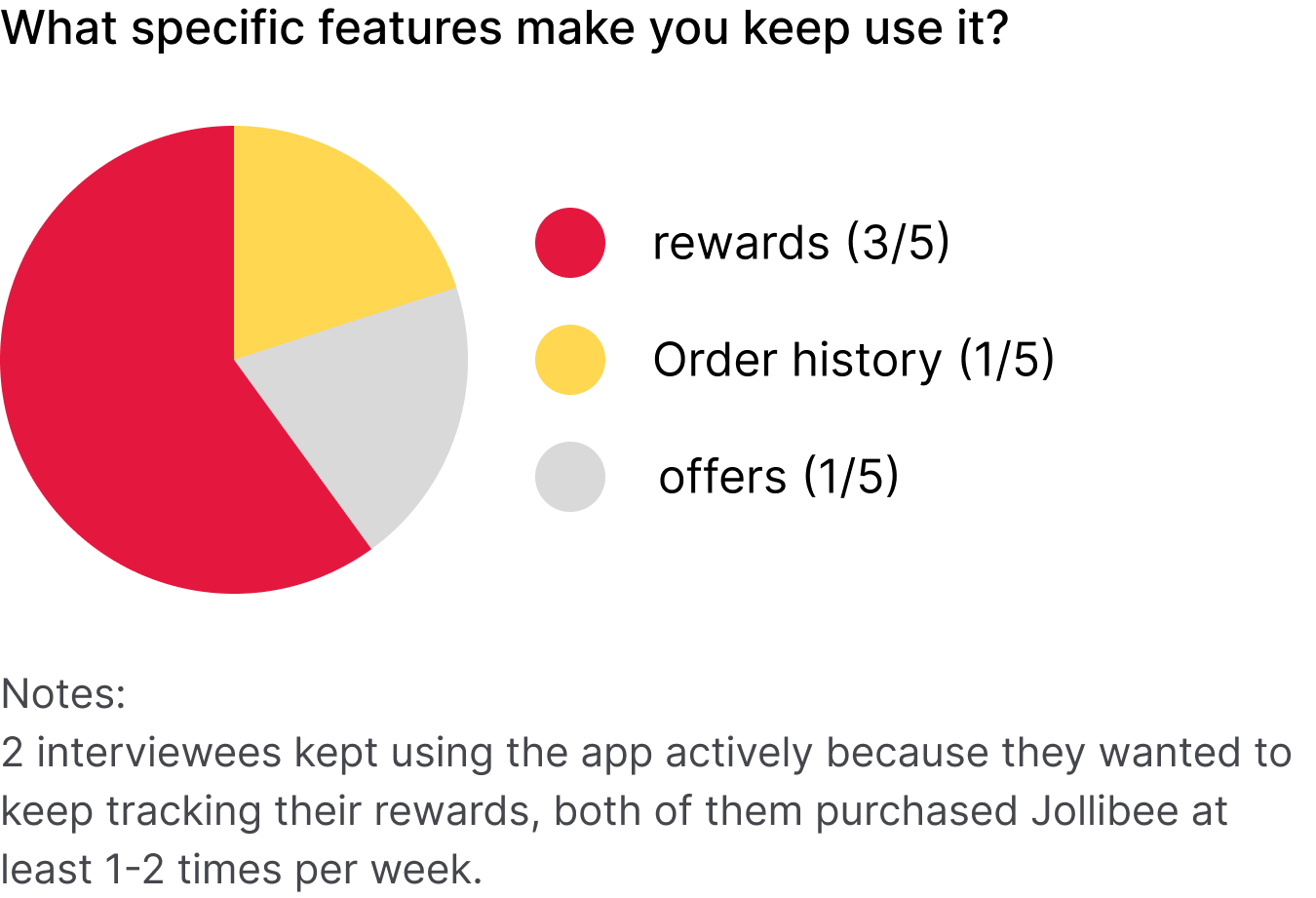
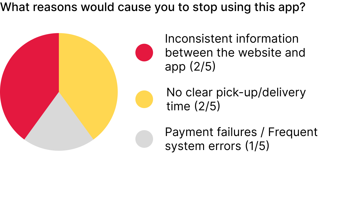
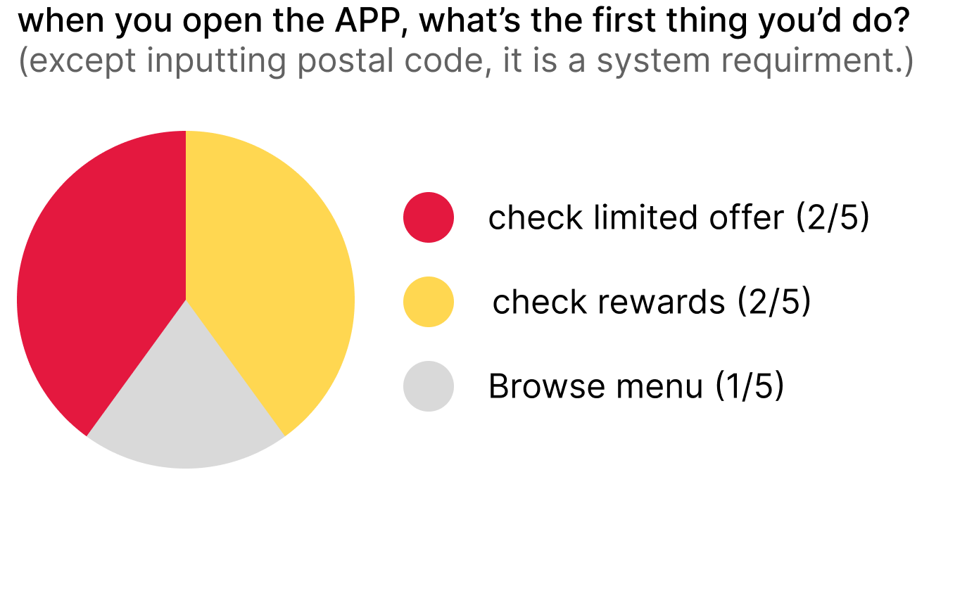
With that question in mind about mobile ordering, I drafted a couple of questions and started casually asking people at the Jollibee restaurant about their ordering habits between 5 pm and 8 pm (5 interviewees who have downloaded and used Jollibee APP already).
Key insights:
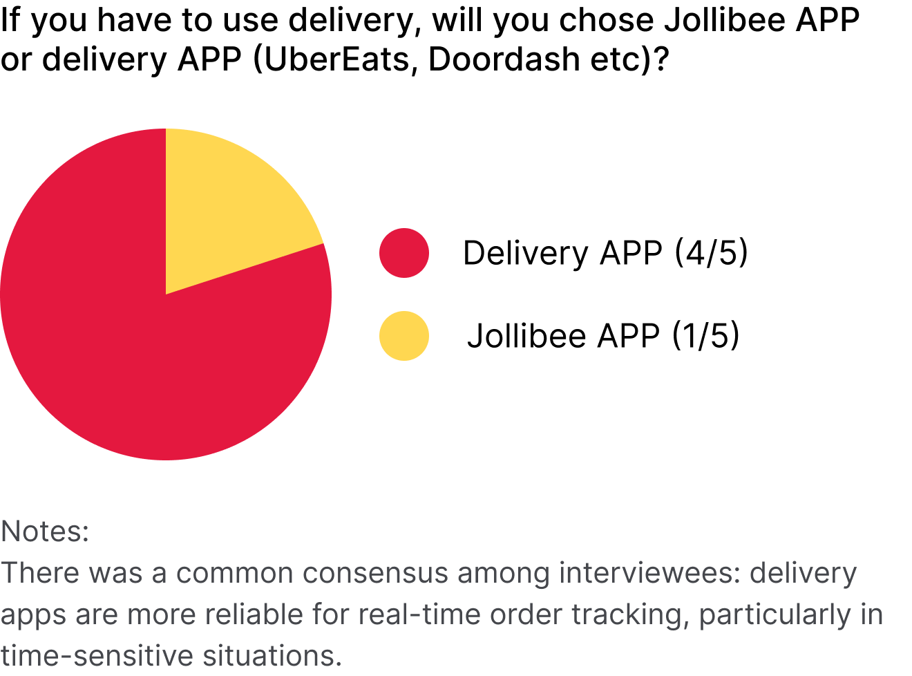
During user interviews, there was an important question raised in my mind: how many users actually prefer the restaurant's own app? While interviewees expressed a preference for the Jollibee app due to exclusive offers and the ability to earn reward points, the small sample size made me realize the need for broader data. This prompted a further investigation to determine whether the product was truly valuable to the wider user base.
Due to time constraints, I turned to online forums as the quickest way to gain insight into whether this app serves the interests of multiple stakeholders and if it is truly necessary.
What I discovered was surprising. In addition to pick-up users who preferred the app for accumulating reward points, there was a growing sentiment encouraging customers to order directly from restaurants rather than through third-party platforms. This was driven by a shared concern to avoid third-party apps, which often cut into restaurant profits and add extra fees on drivers and delivery services. However, some restaurants either don’t offer delivery services or lack their own apps.
Thus, it’s clear that the Jollibee app offers significant benefits for both customers and the business. For customers, it provides a way to save time and money on orders. For the business, it helps reduce operational costs while retaining valuable customer data.
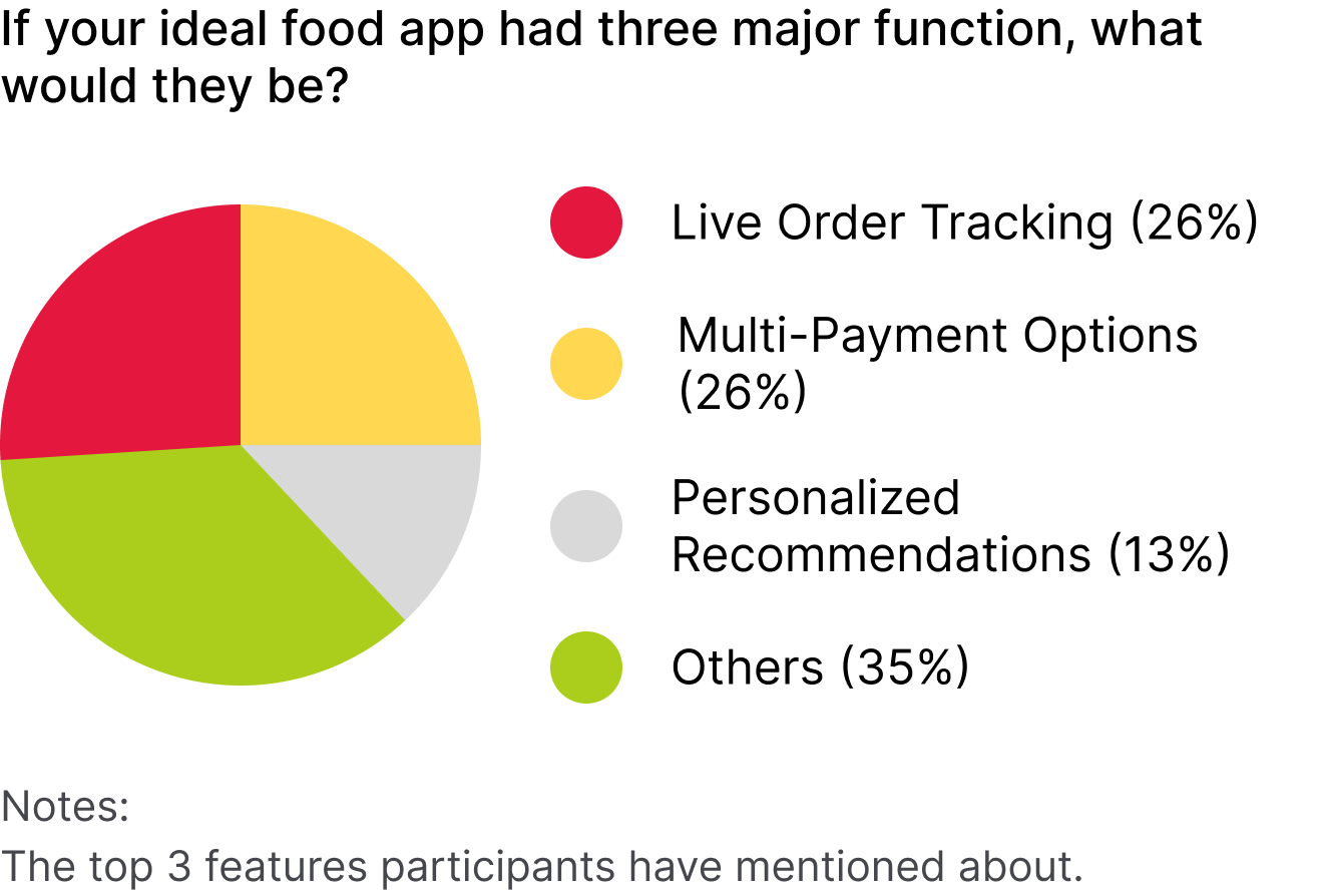
After observing how people use the Jollibee APP and other resturant APPs, combined with user interviews, I found they have some major concerns:
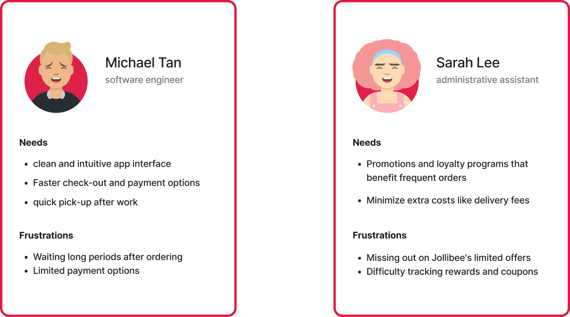
Based on my research and findings, I created the following personas to guide my design process.
To better understand the strengths and weaknesses of the current market, I downloaded and analyzed popular restaurant apps, focusing on their usability, features, and overall user experience.
3 direct competitors: McDonald’s, KFC, Popeyes; 2 indirect competitors: Doordash, UberEats
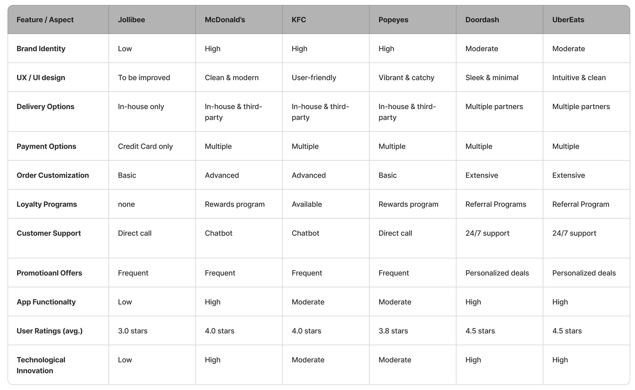
I found there are a few gaps between the Jollibee APP and others:
Based on user needs and the gaps identified in existing products, I summarized the higher-level goals I hope to achieve with the redesign.
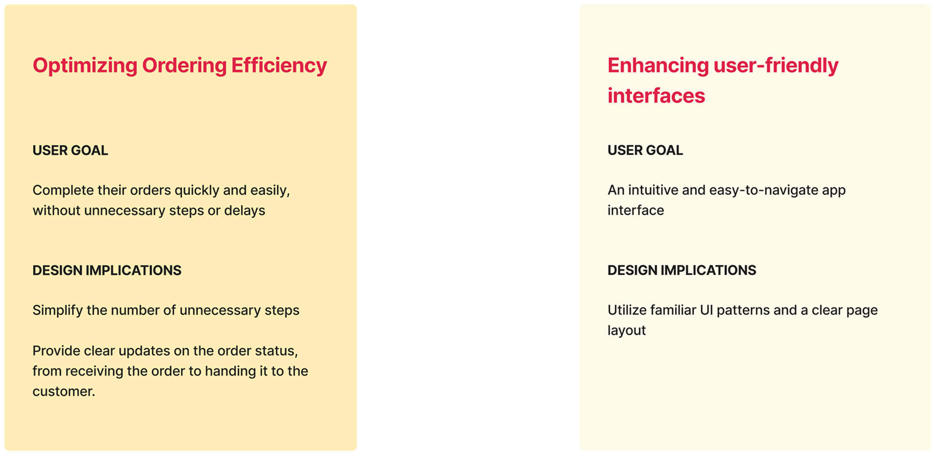
Firstly, the focus should be on process optimization by reviewing the current architecture and identifying areas for improvement in information organization and flow. This will enhance overall efficiency and elevate the user experience.
Secondly, adjustments to the page layout should aim to create a more user-friendly interface, improving the success rate of user actions while reducing task completion time.
Lastly, throughout the redesign process, it is essential to maintain a consistent visual language to strengthen Jollibee’s brand identity.
The current ordering process is frustrating; users must re-enter their postal code or address each time they reopen the app to determine their location. From my user research, I learned that users need a simpler, faster way to complete orders with fewer unnecessary steps
To create the current user journey map, I focused on Persona 1 - Michael Tan, a software engineer with specific needs and frustrations.
Let’s explore the potential within the areas of user frustration.
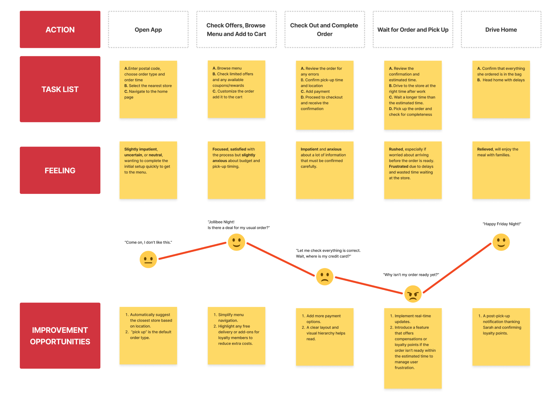
So Where Should the Redesign Happen in System?
I created a user flow to figure out how to best fix it.
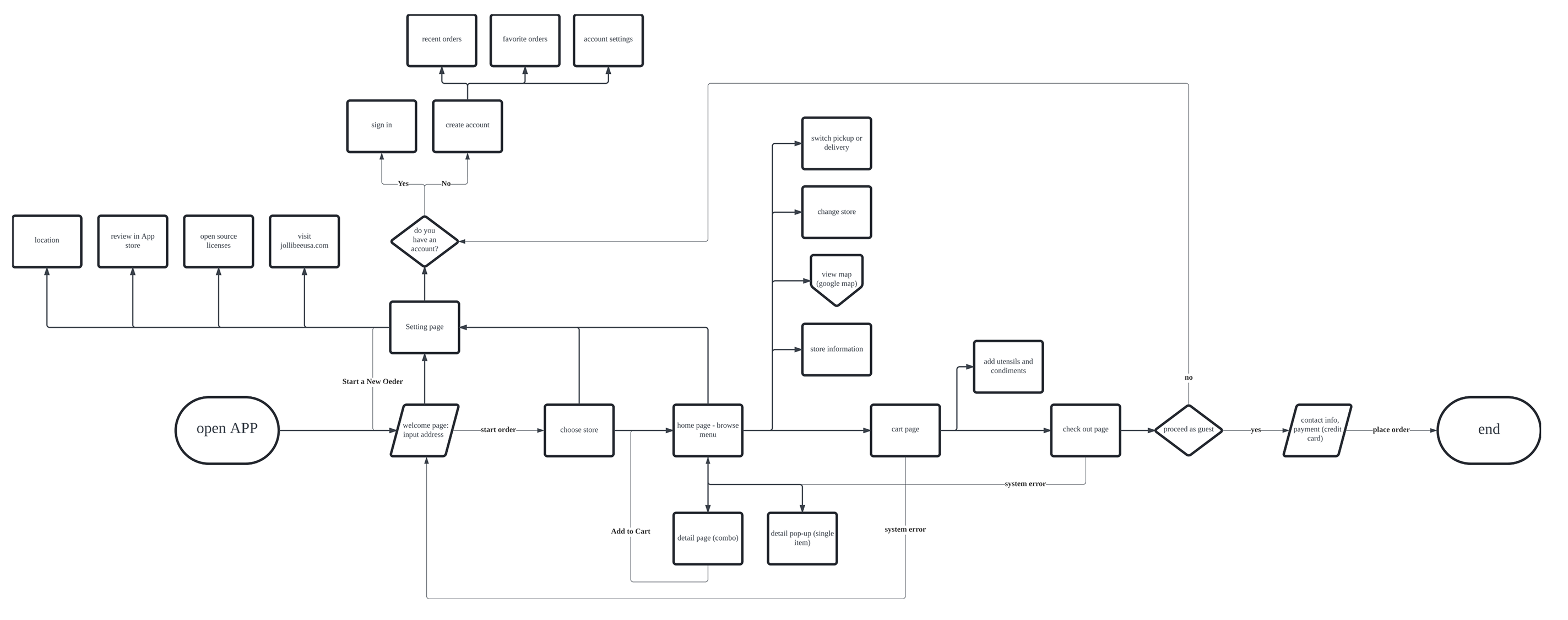
Users must go through several steps to reach the menu and start their orders, which is quite frustrating. This process can be simplified as much as possible. When examining the ordering process, it is linear and inflexible - users must backtrack step by step to make any changes. However, if there is a system error, users are forced back to the first page without any prompts. It lacks the clear navigation that users are accustomed to which contributes to a sense of anxiety when using the app.
I also noticed a discrepancy between the Jollibee website and the app, such as different coupons and the Jolly Merch Shop, which could be integrated into the app.
If this were a real project, I would definitely start by collaborating with engineers and product managers to ensure we stay within scope, including technology constraints and the business budget. For this optimization, I will take a more conservative approach by limiting changes to the existing information architecture.
Reworking the card sort enabled me to define a user flow focused on essential tasks and information organization.
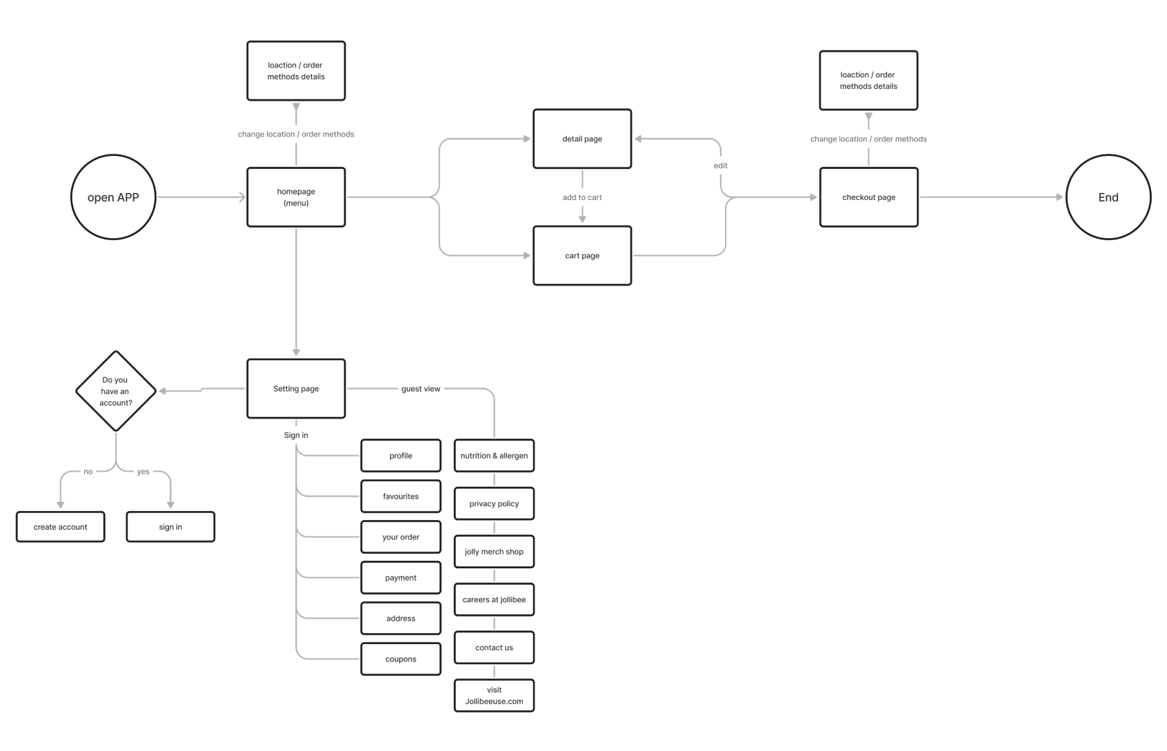
The new user flow focuses on two primary tasks: ordering and account settings.
For ordering, I streamlined the process by reducing several steps, making the app more intuitive. The homepage now prominently displays the menu, allowing users to start ordering immediately without unnecessary navigation. Categories are clearly defined and visually distinct, making it easier for users to find their desired items quickly.
The settings page is dedicated to managing account details, providing a centralized location where users can effortlessly update their personal information, and payment methods, and check more details. The layout is clean and organized, with clear sections for different aspects of account management, ensuring that users can easily find and access the information they need, reducing the cognitive load.
I referred back to what I learned from the user interviews. Most users I spoke with spent most of their time reading through text. Some similar content caused confusion, requiring users to read carefully to select items. Regarding order details, even though there are red highlights for important text information, the lack of clear hierarchical information forces users to read each line meticulously.
These issues can be summarized into two main problems: unclear structural hierarchy and cumbersome context. Let’s look at them.
Pain points: Increasing effort to understand the content. Leading to higher cognitive load.
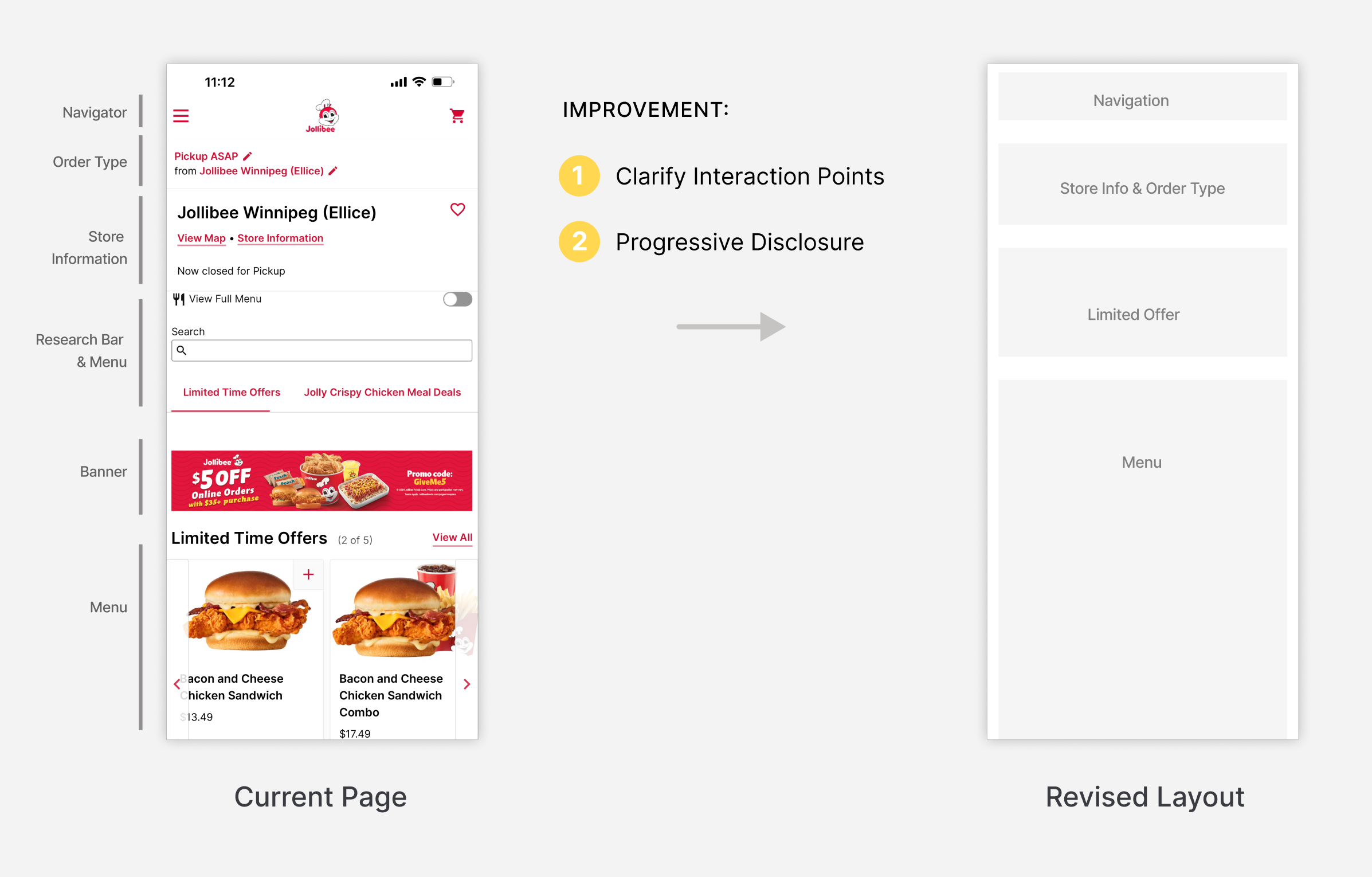
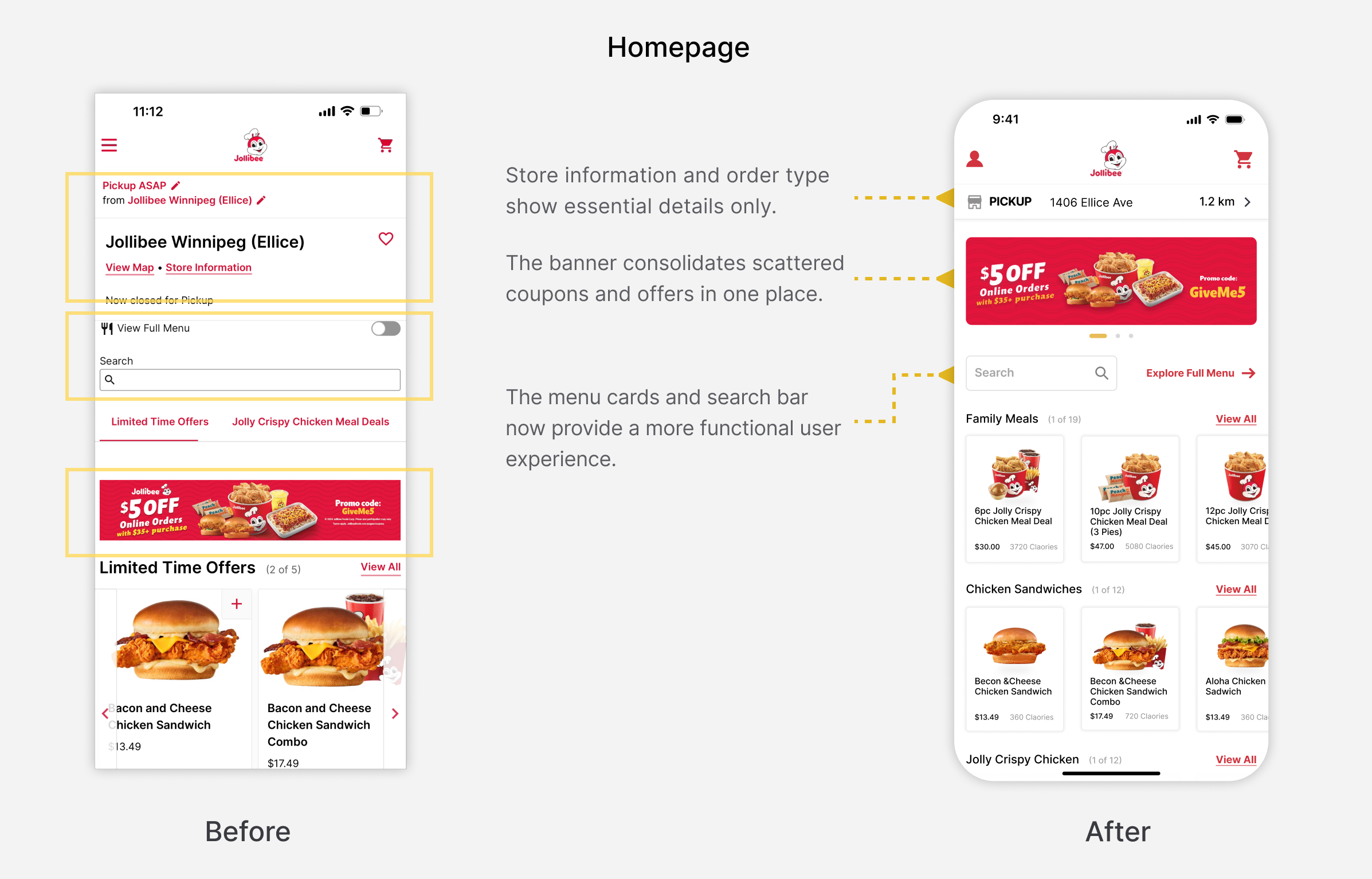
As a restaurant app, location and order type are key concerns and should be prominently displayed based on user needs.
Limited offers and coupons were a common issue mentioned during user interviews, noting inconsistencies between the website and app. To address this, I designed a banner to centralize offers and coupons, capturing attention and encouraging orders.
Next, I redesigned each section.
Since this is a chain restaurant, the priority is to clearly present key ordering information, like order types and store details, enabling users to quickly change their preferences. With this in mind, I sketched two alternatives and evaluated their pros and cons.
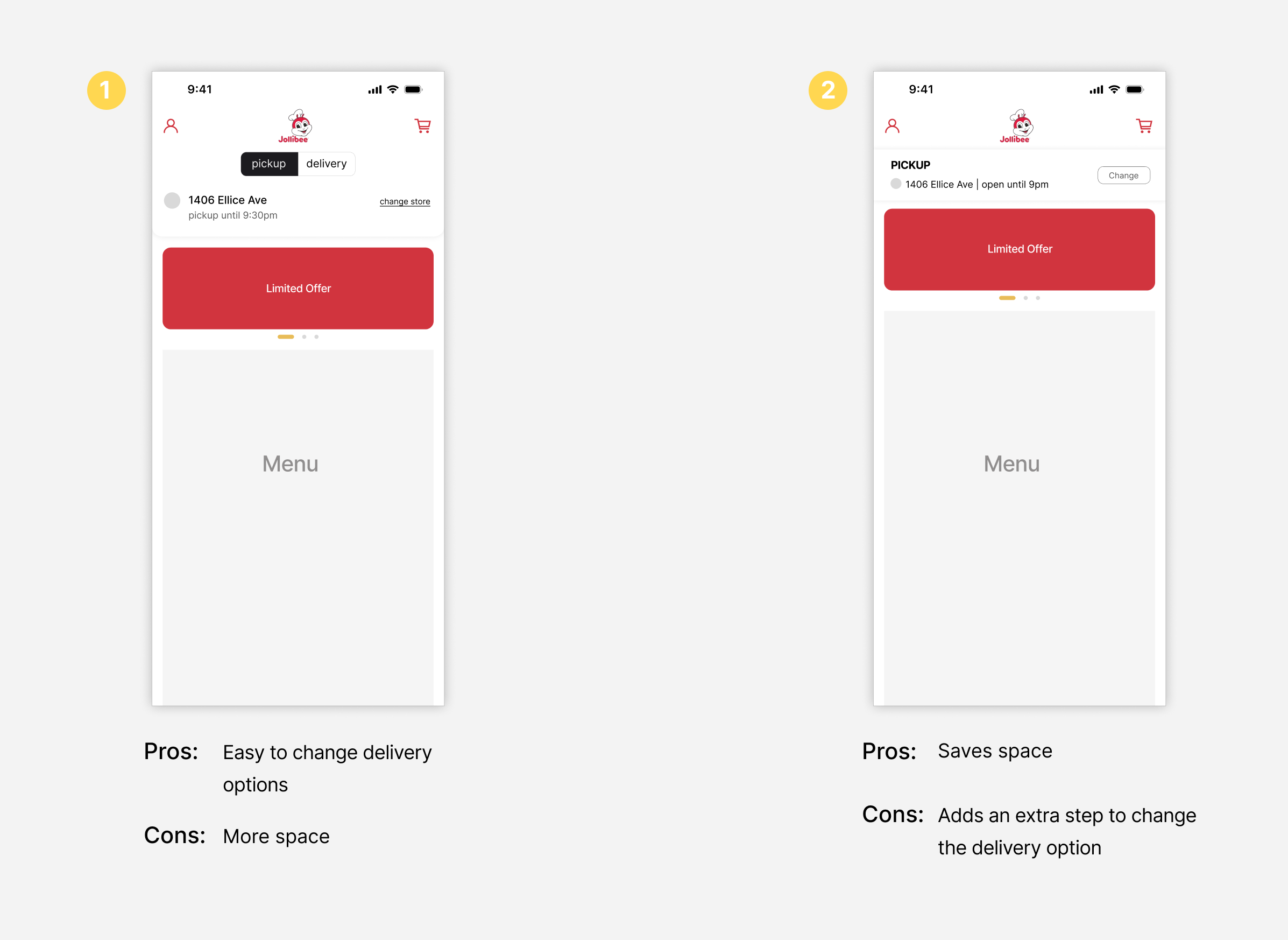
On the surface, Option 1 appears the most convenient. However, in practice, when users need to update their delivery address or store location, such as when entering a postal code or adjusting their location, the process is more complex. Therefore, it makes more sense to proceed to the next step for detailed adjustments to delivery or pick-up information. In this case, a design that prioritizes 'space-saving' and 'simplicity' would be the optimal solution.
I reviewed user needs for both pick-up and delivery options. When users select 'pick-up,' their main concerns are the store's address and its distance from their current location. And when they choose “delivery”, they wonder how long they could receive their order.
Therefore, I designed the third alternative.
I explored several new card designs for of menu section, ultimately deciding to maintain the original structure. I recognized that future iterations would benefit from user testing and data analysis to validate design choices.
Pain points: Increasing effort to understand the content. Leading to higher cognitive load.
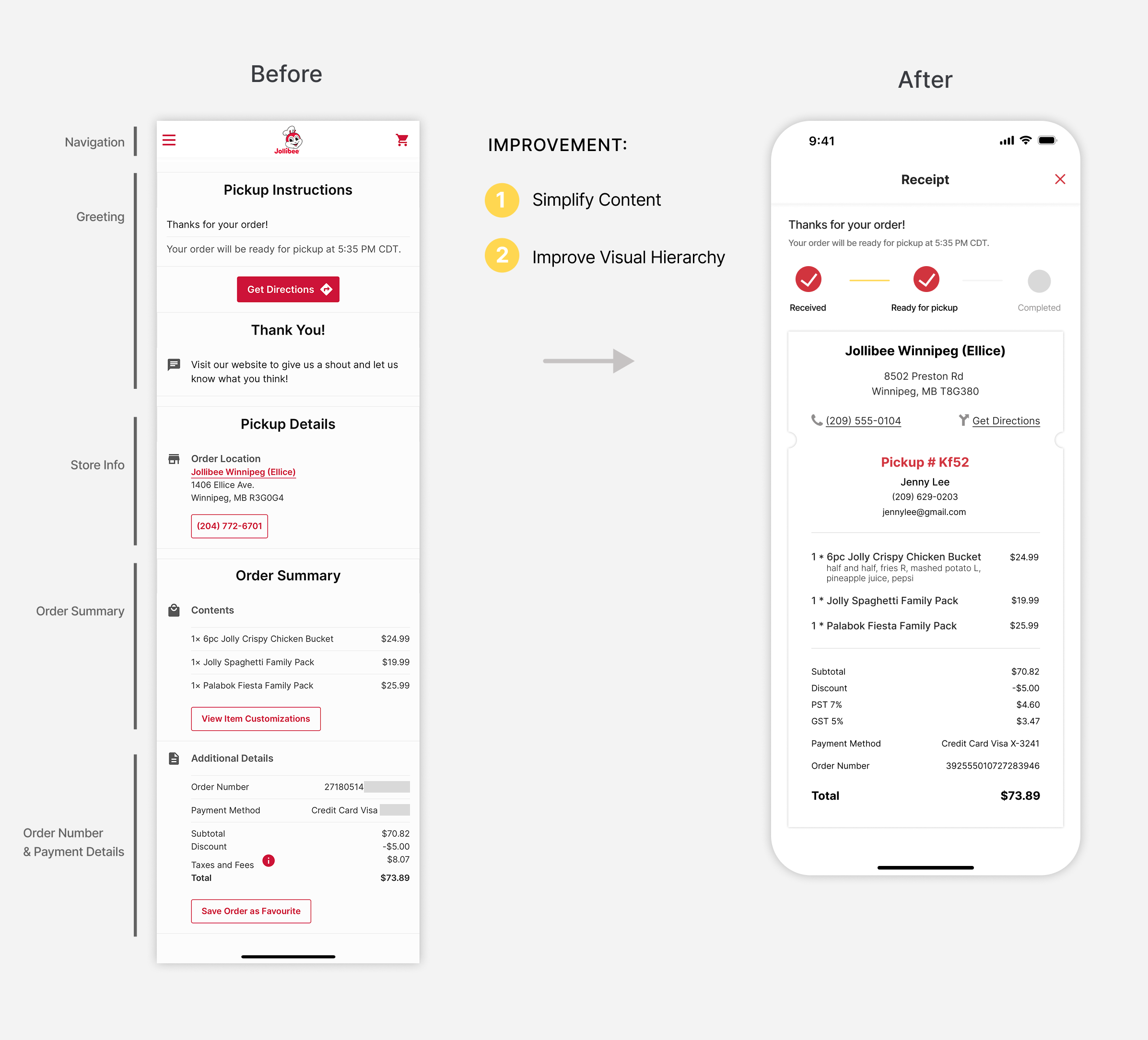
The original page used dividing lines to separate information, which works but forces users to read line by line without clear grouping.
I redesigned this into a receipt-style card, dividing the page into two sections: one for tracking order progress and the other for order details. This structure mirrors the way users read paper receipts, making it easier for them to find relevant information quickly and improving overall accessibility.
Pain points: deterring users from reading, extra time spent, high error rates.
This is one of my favorite pages, as it reflects Jollibee's commitment to environmental sustainability. Small design choices can have a butterfly effect, creating significant outcomes.
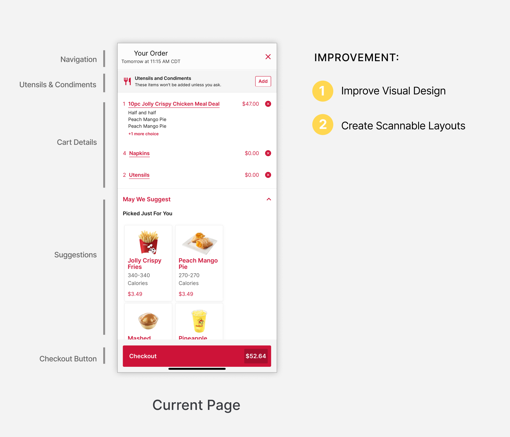
In redesigning the 'Utensils & Condiments' module, I aimed to create a more engaging user experience rather than a simple prompt asking, "Do you want utensils and condiments?”
I crafted a concise slogan to promote sustainability while respecting users to make their choices regarding these items.
I retain the existing checkout button to display the exact amount to users. This aligns with the psychological principle of 'Specificity,' which indicates that providing clear details about what will (and will not) happen can alleviate anxiety associated with taking action.
.png)
As a designer, every decision must be backed by clear reasoning. If this were a real project, I would base my final choice on user testing, analyzing interaction times and error rates. I would then collaborate with the product manager to ensure the outcome aligns with both business goals and user interests.
Due to time constraints, I made an educated assumption that users prefer simpler interactions to save time, leading me to choose "Option 1: Tap". I also addressed content blindness - users tend to overlook repetitive items.
To counter this, I staggered the layout of item selection and utensils to visually highlight our sustainability message, encouraging users to add utensils only when necessary.
.png)
Empty states, which are screens that appear when no data or content is available, are essential for a seamless user experience. These states can be categorized into three main layers: System Level, Information Level, and Empty Level.
Currently, the Jollibee app offers only a single textual description for its empty states. While clear, it lacks engagement and personality.
I have redesigned the empty state pages to align with the brand's style, incorporating more enjoyable elements to improve the overall user experience.
I would organize internal user testing, grouping participants by age categories (young adults, middle-aged adults, and older adults) to account for variations in how different age groups comprehend visual elements. Additionally, I would consider varying user types (heavy mobile users vs. casual users), as they may have distinct experiences with interaction methods and feedback.
Throughout the project, I would maintain close collaboration with the tech department to ensure all technical aspects are implementable and delivered on time.
Ultimately, the design outcome should not solely reflect the designer's personal style; rather, it should embody a collaborative effort that maximizes benefits for both users and the business.
To ensure design cohesion, I redesigned key pages and refined component details. While preserving Jollibee’s core color palette and branding, I enhanced the user experience by optimizing visual hierarchy and layout.
.png)
For this redesign, the key improvements focused on achieving task completion rates and increasing app usage. Without access to Jollibee's current tech stack, I couldn’t estimate the impact of these design changes on the information architecture or the coding effort required. As a designer, close collaboration with engineers would be essential in a real project to ensure we deliver the project within scope and meet the client's expectations.
From a business standpoint, competitor analysis and user interviews clearly highlight the need for a loyalty program at Jollibee. During the design process, I noticed that while the website has a 'My Rewards' section, the app still lacks a clear display of this feature. I attempted to contact Jollibee's business office via email for clarification, but did not receive a response. As a result, I did not delve further into this aspect.
Additionally, the delivery page was not thoroughly explored in this project. Based on my findings, Jollibee’s partnership with Uber for deliveries often results in inaccurate delivery times, which remains an unresolved challenge.
These aspects would require further discussions with management to ensure the design aligns with the company's overall strategy.
Due to time constraints, I wasn't able to present design alternatives or the final design to real users for structured feedback. However, I did casually show them to friends who are fans of fried chicken and gathered some informal insights. There were several questions I would have liked to explore further if I had more time:
In addition to addressing these questions, I plan to develop a strategy to evaluate the success of my design and identify usability issues. Given the app's large user base, I would also consider rolling out changes gradually and conducting A/B testing where possible.
Since the Jollibee app is cross-platform on both iOS and Android, I will consider how the UI adapts across platforms, as well as incorporating different payment options for each system.
This is my first time redesigning an existing product with a large user base. It wasn't just about aesthetics; it pushed me to think critically about the business strategy and how the new design would alter the app's existing flows, interactions, and underlying logic.
With a large user base, I made conservative choices for the interfaces and interactions to align with existing user habits. While I’m unsure if this is the best approach for redesigns, I'm eager to explore and learn more.
Throughout the project, I wrote down every idea that came to mind in my notebook, no matter the quality. I dedicated time to reviewing and refining them, and several ideas made it into the final design. I plan to continue this practice throughout my design career.