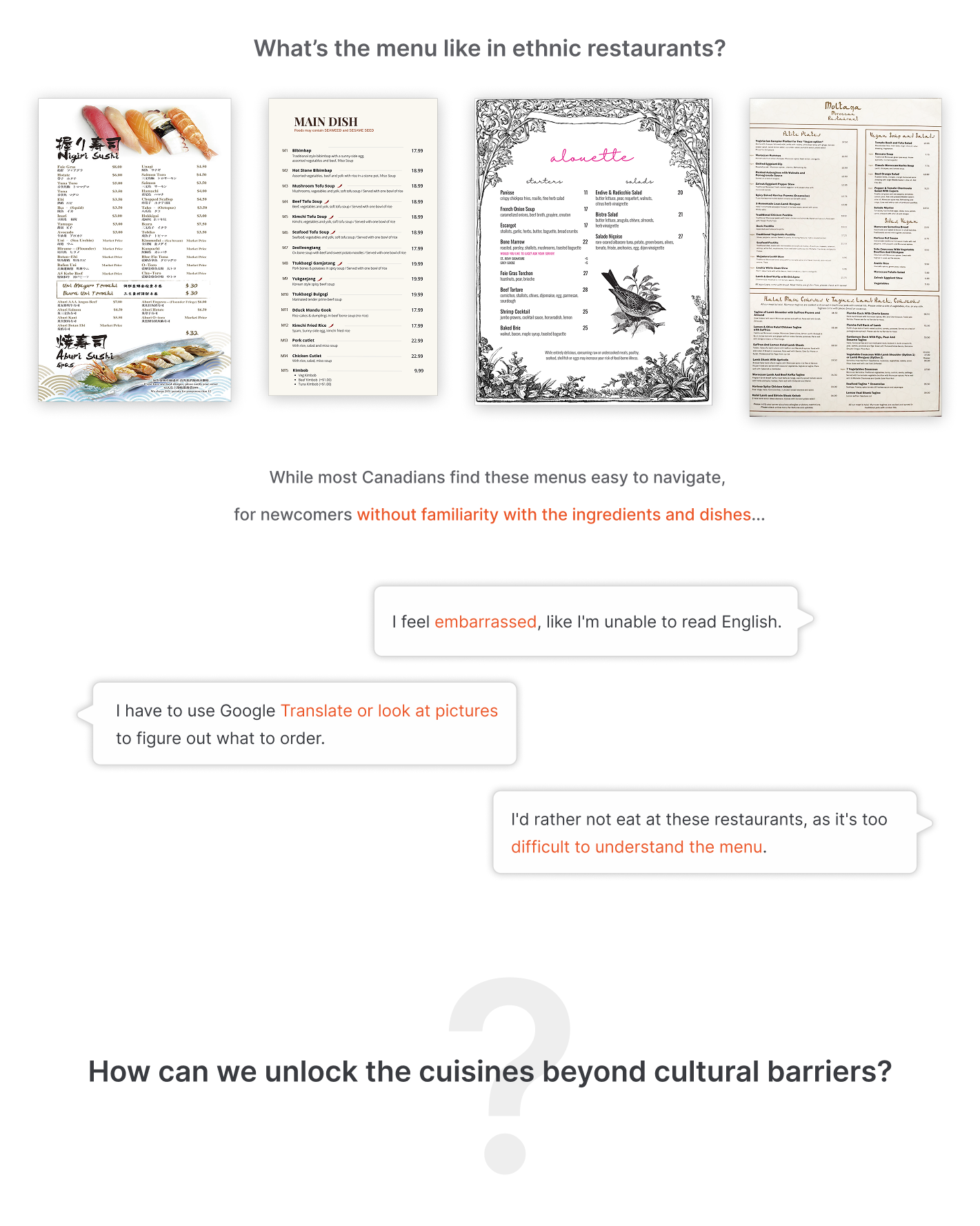
Immigrants bring different food and cultures to Canada, but a lot of people feel embarrassed and frustrated visiting ethnic restaurants, and end up not exploring the diverse cuisine options available. Some of them cannot understand the menu, and some are frustrated about the potential risk of allergies.
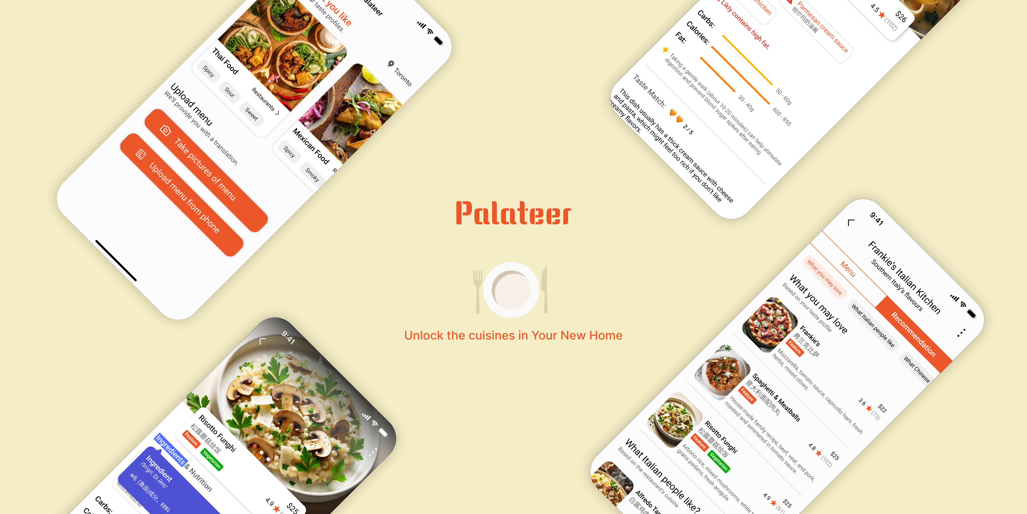
We designed Palateer, a mobile app that empowers our users by providing personalized dish recommendations and reviews based on their taste profiles and the cuisine of the restaurant. It also enables users to quickly see the dish and ingredient name in their language, and alerts them of potential dietary constraints based on the dish's ingredients.
As the Lead UX Designer and Researcher on the team, I advocated for conducting user interviews, synthesis sessions, and brainstorming sessions before arriving at solutions.
I led all the research & design activities with engineers and created wireframes, high-fidelity designs, and interactive prototypes for user feedback & testing.
We began by researching the market to determine if existing products adequately address the challenges immigrants and newcomers face when ordering in ethnic restaurants. Our research revealed no direct competitors, so we identified several alternative competitors for further analysis.
.png)
We found some gaps:
To address this need, we are designing a tool that empowers users to easily understand menus and discover dishes tailored to their preferences.
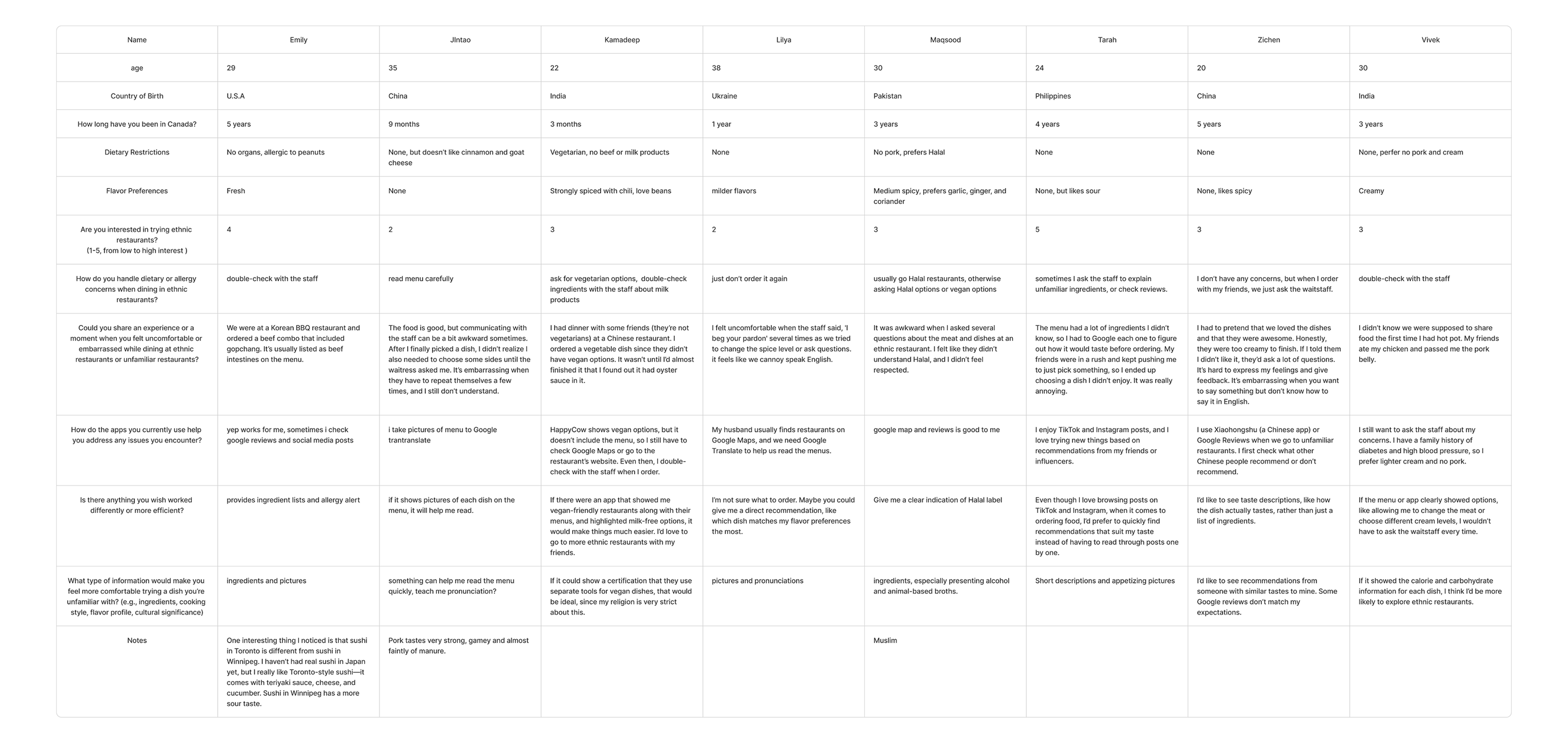
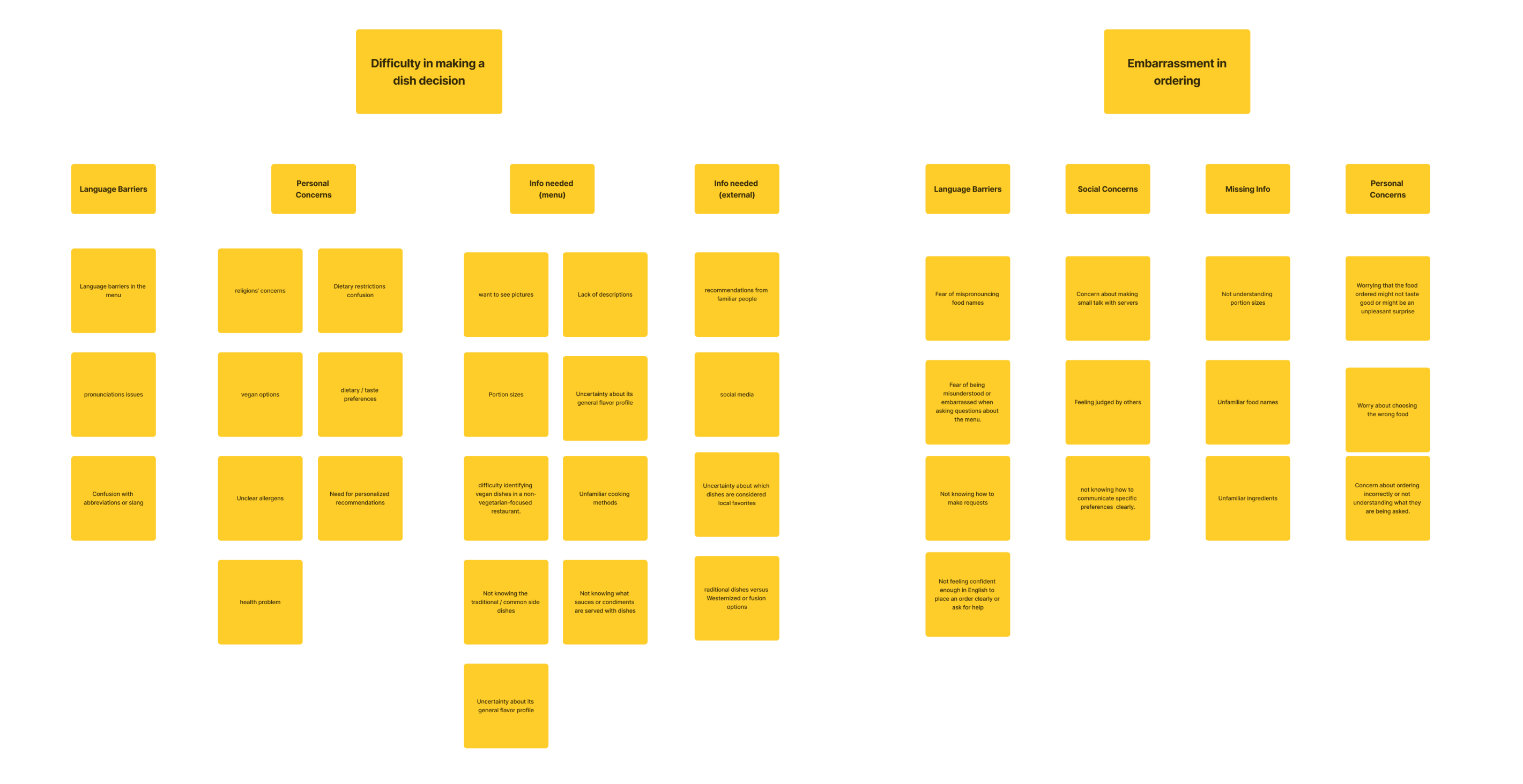
To understand the ordering process for newcomers and immigrants in ethnic restaurants and identify potential pain points, I advocated for conducting user interviews before exploring solutions. I also included our developer in affinity mapping sessions to collaboratively brainstorm solutions based on our research.
We interviewed around 8 people who have stayed in Canada for different amounts of time, ranging from 3 months to 5 years.
We found some gaps:
These difficulties lead some newcomers and immigrants to stick to familiar dishes, while others avoid these restaurants altogether.
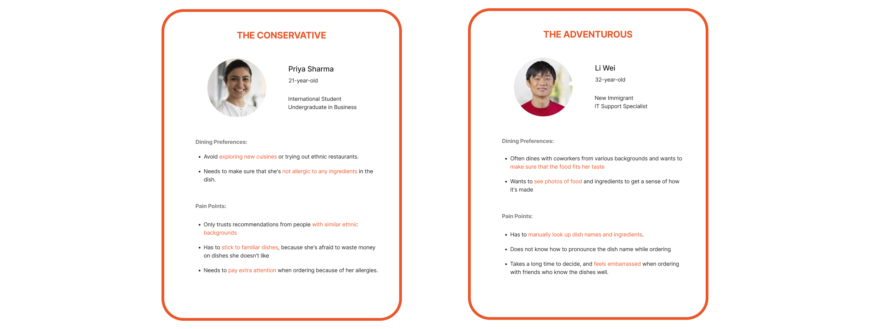
To inform our design and foster team empathy for our users, I synthesized the interview findings and developed the following personas:
After a group discussion, we decided to target users with language barriers or basic food restrictions. This lets us narrow our project scope and focus on the essential functions.
We decided to create a product that helps users quickly understand what each dish is made of and recommends dishes they might enjoy based on their flavor preferences and dietary restrictions at ethnic restaurants.
We fully understand and respect PIPEDA provisions and are committed to strictly adhering to all relevant privacy regulations to protect our users' personal information.
I invited our engineers in a brainstorming session focused on generating diverse solutions, deferring feasibility considerations to a later stage.
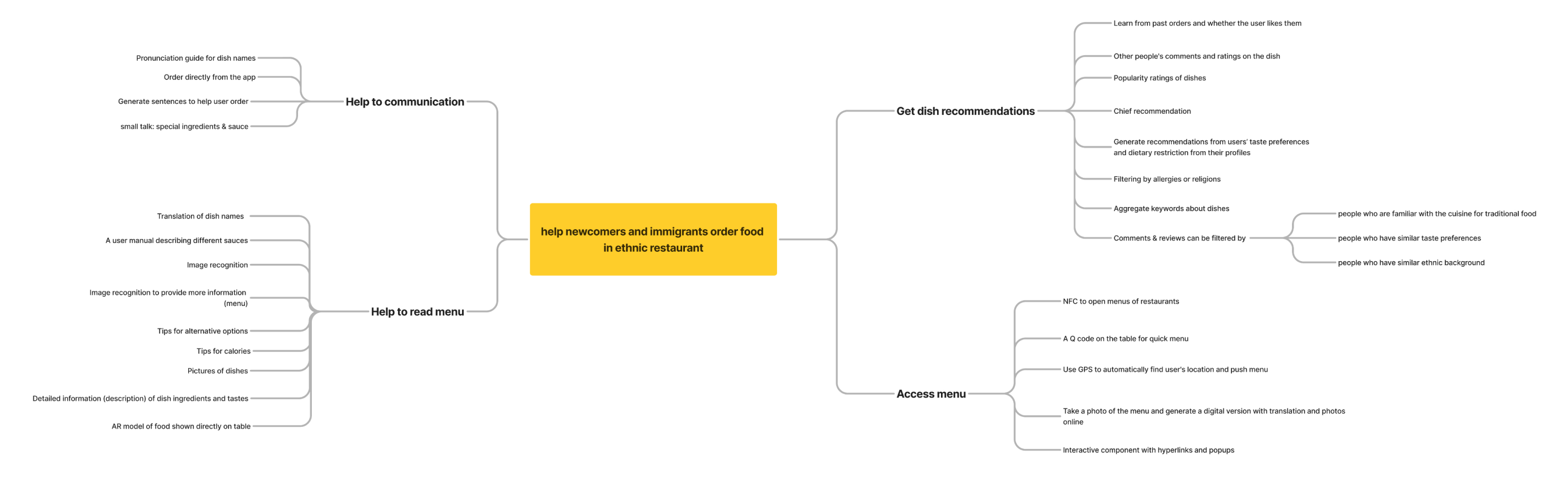
We then reviewed the ideas and discussed their feasibility for implementation. By creating a flavor profile for each user, we can leverage the ChatGPT API to quickly interpret menu information and generate recommendations tailored to users’ needs and expectations. While this is a feasible solution, further testing and discussion are needed to evaluate the integration of the AI API.
Another challenge arose during the discussion: how to design the system for accessing menus. Allowing our AI to retrieve menus directly from restaurant websites could be too complex for our developers to implement within the given time constraints. An alternative approach we considered was providing NFC tags to restaurants, enabling customers to quickly access menus by tapping the tags. However, the difficulty of promoting this method and its high implementation cost made it impractical.
Therefore, we decided to make a compromise and start by providing recommendations based on users’ ethnicity as our first step.
I quickly sketched out the key pages of these functionalities with the team to ensure everyone had a clear understanding.
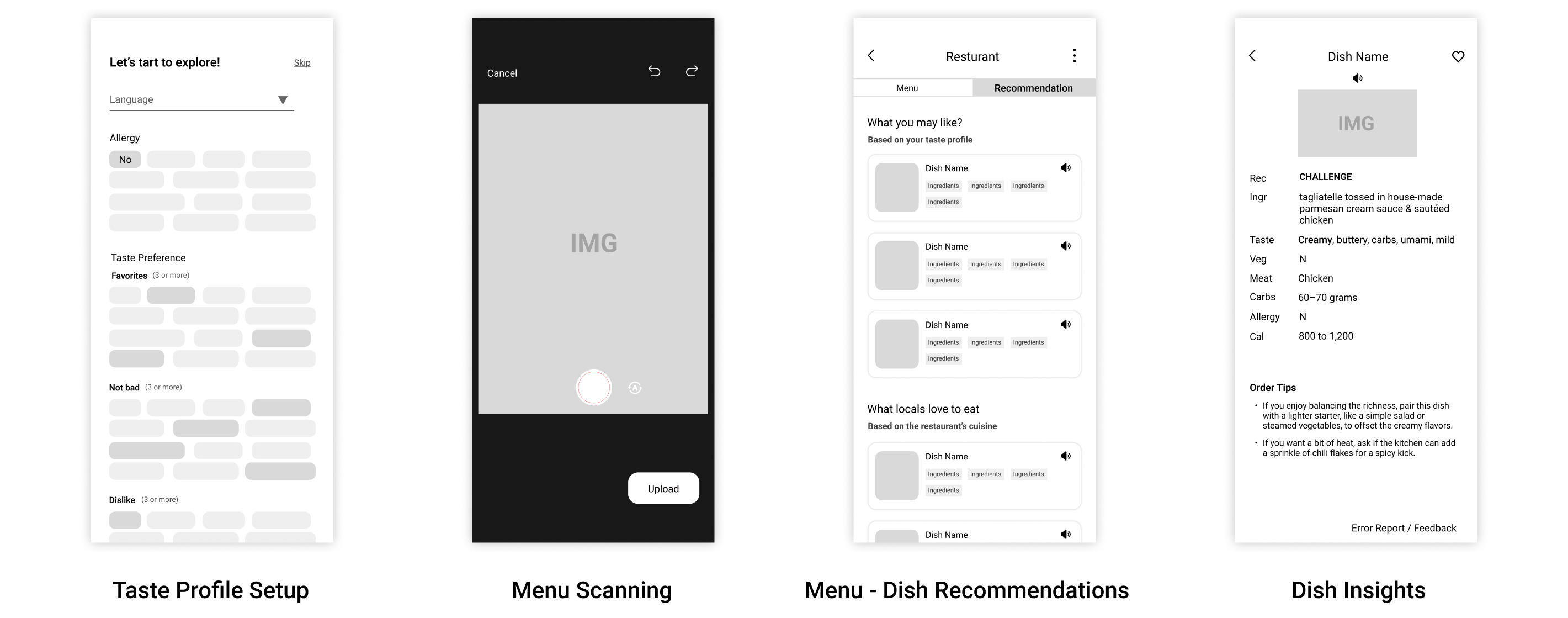
We created the following wireframes and brought Figma prototypes to our potential users for feedback.
The positive user feedback on the menu recognition and customized dish recommendations confirmed the value of these core features, which set our app apart from existing solutions.
Our user testing revealed a key insight: although users were comfortable using the pronunciation feature in the controlled setting of our office, the real-world context of a restaurant seemed to inhibit its use. Users appeared self-conscious about using the feature, and accidental activation often resulted in them quickly turning the volume down.
We attribute this behavior to Social Desirability Bias. In a restaurant, users may avoid the feature to avoid attention, while in our office tests, they likely used it assuming we expected them to.
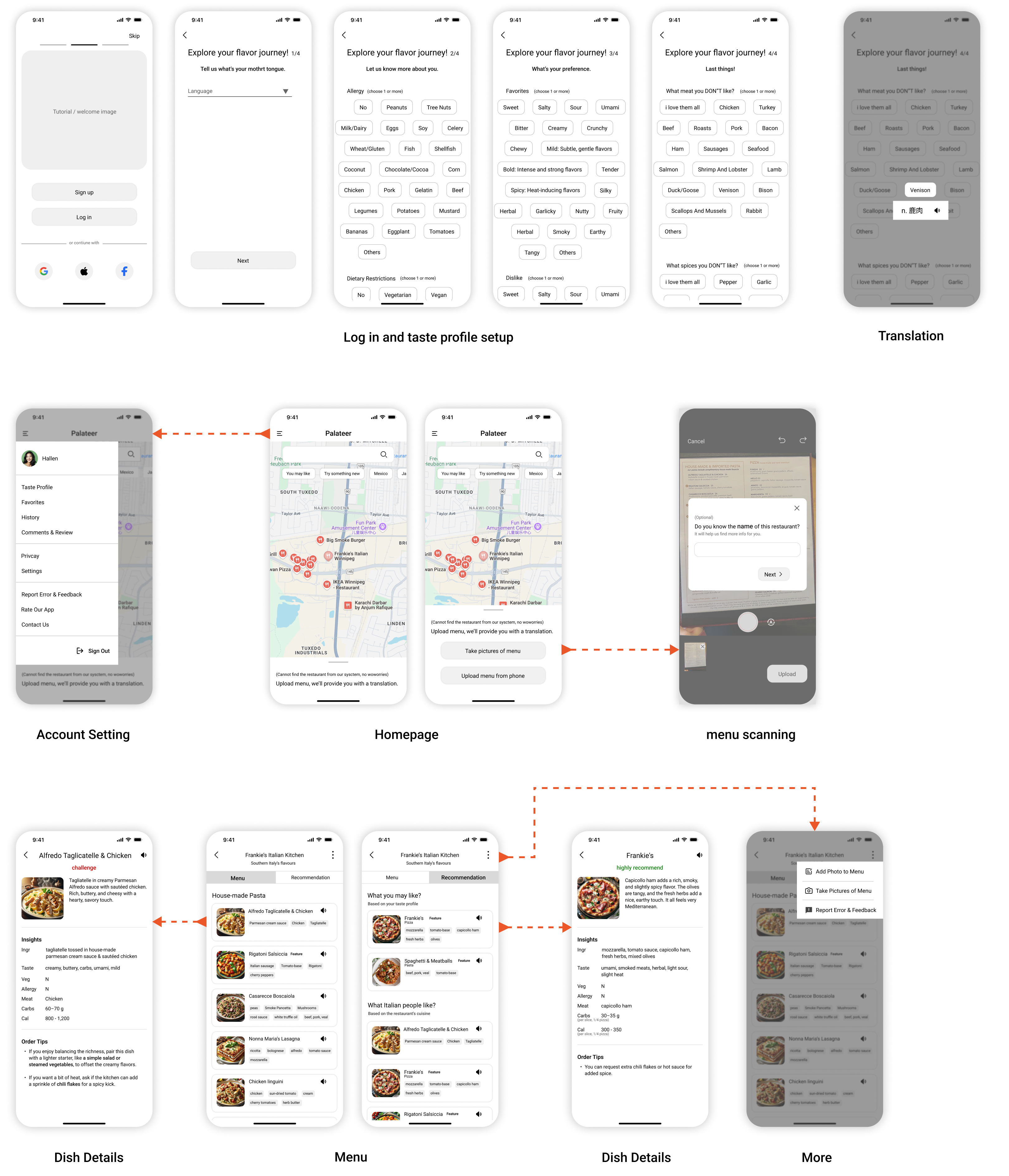
To make ordering in ethnic restaurants a more comfortable experience, we designed the pronunciation feature to be less prominent (a secondary function) to minimize accidental touches and provide assistance only when needed.
After talking with more users and observing behaviors, we came to realize that one of our most important goals is to balance English and translation and empower our users, who have friction about how to order dishes right now.
The rationale for the design is that for the newcomers and immigrants group we’re targeting, usually know the English language and some of them are pretty well to live and study in Canada; they just have little exposure to the diverse cuisines and feel intimidated to get started. Therefore, instead of providing them with a tool that’s completely in their language, we hope to build something that’s primarily in English (or French), with translations on demand. In this way, we hope that our users can gradually learn the terms they don’t understand, and rely on our tool less and less as they use it more.
The user test showed that new users have a large demand for translation when setting taste preferences, and the long-press translation design failed to effectively meet this demand, but instead increased user frustration. To solve it, we optimized the translation function. Key phrases will be displayed in English and translation side by side, while retaining the long-press translation function. Flavor tags are directly displayed in bilingual form, taking into account practicality and immersion.
So how do we find the balance point?
To categorize the terms by complexity and cultural universality, we determined which terms required direct translation and which could rely on the long-press translation feature.
“Low complexity” - common and intuitive basic vocabulary (such as “sweet” and “salty”), unlikely to cause misunderstanding, displayed in English.
“High complexity” - sensory perception, cultural background, or polysemy, which are unfamiliar and difficult for new immigrants to understand (such as “umami” and “earthy”), provided with translations in the user's native language to reduce cognitive load and anxiety.
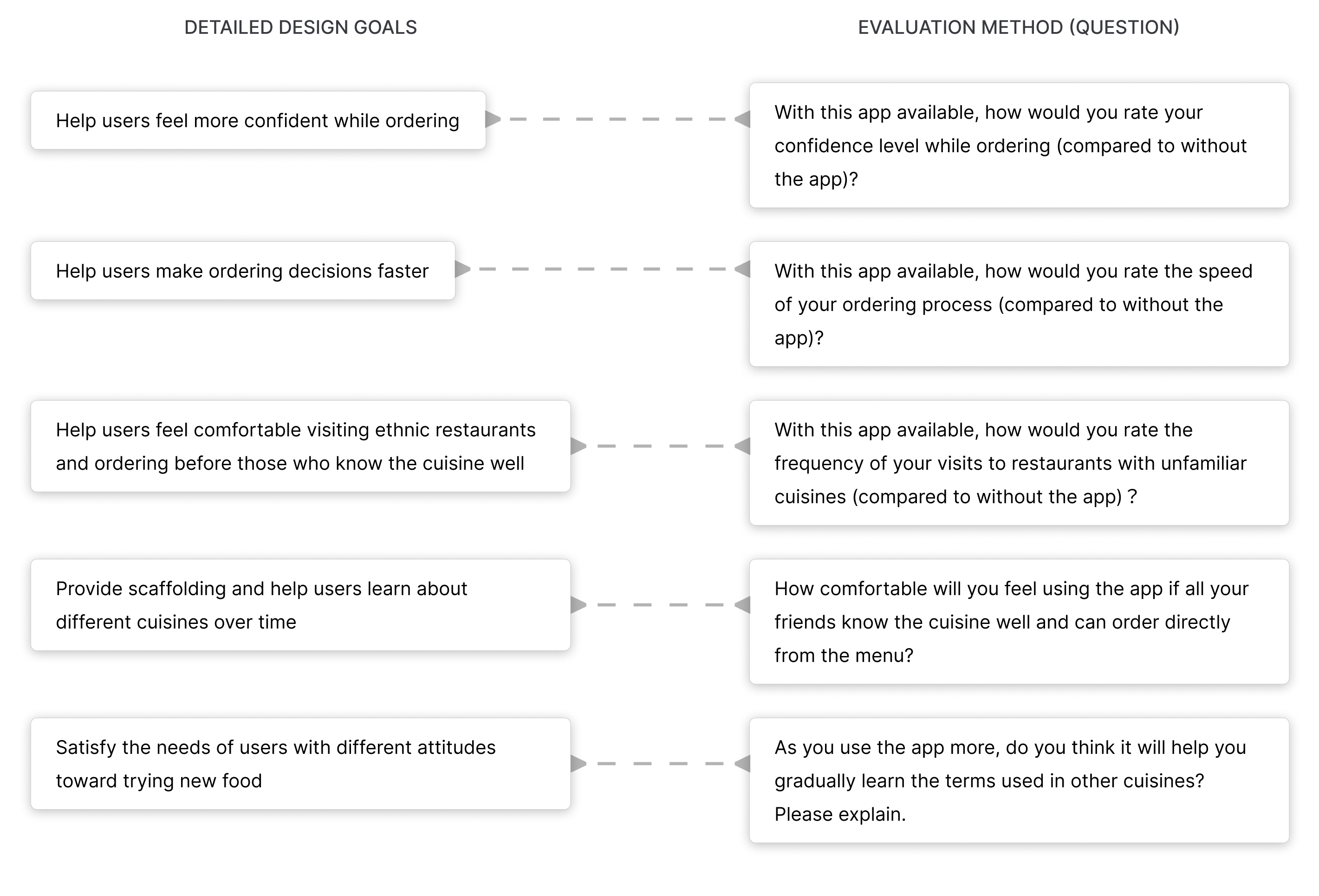
For the first iteration, my primary goal was to validate whether the design increased user confidence, simplified ordering decisions, fostered comfort in visiting ethnic restaurants and ordering in the presence of those familiar with the cuisine, and facilitated gradual learning of basic culinary terms. I also hoped to test the usability of the design, so that I can improve upon it.
I used Figma and Protopie to create a basic interactive prototype to illustrate enough functionalities for me to test my hypotheses.
.png)
I conducted user feedback sessions with five participants (Chinese) representing different attitudes towards trying new foods and varying familiarity with Italian cuisine (the cuisine featured in my prototype).
To quantitatively evaluate the design, I defined specific, measurable objectives derived from the overall design goals and created a questionnaire to assess those objectives.
User testing participants with different dietary needs, culinary preferences, and Italian food familiarity provided positive feedback. The following summarizes their self-reported ordering speed, confidence, comfort ordering in front of others, and likelihood of future ethnic restaurant visits using the app.
.png)
All five participants expressed confidence that the tool would gradually improve their understanding of culinary terms. They also unanimously stated their willingness to recommend the app, viewing it as a significant improvement over existing resources like Google Translate and ChatGPT for navigating ethnic restaurant menus.
I organized each user's feedback and grouped them by themes and features.
.png)
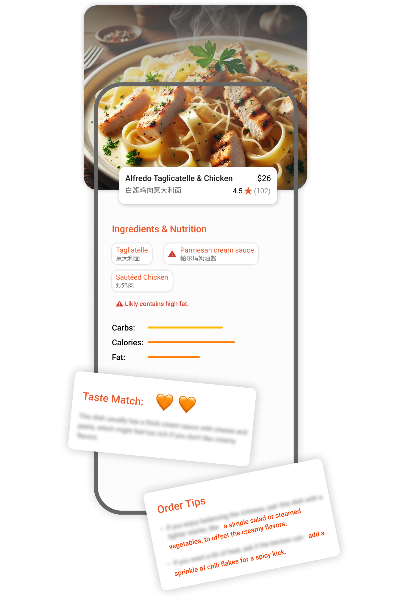
During user testing, participants reported that the card content felt too dense. Highlighting ingredients did not improve readability and instead increased cognitive load.
Due to our initial focus on core product features, the review and rating system is currently outside our scope. Nevertheless, this feedback highlighted the importance of such a feature. I have redesigned the menu page and dish card to prepare for the future implementation of review and rating functionality, enabling data collection as our user base expands and we accumulate sufficient reviews.
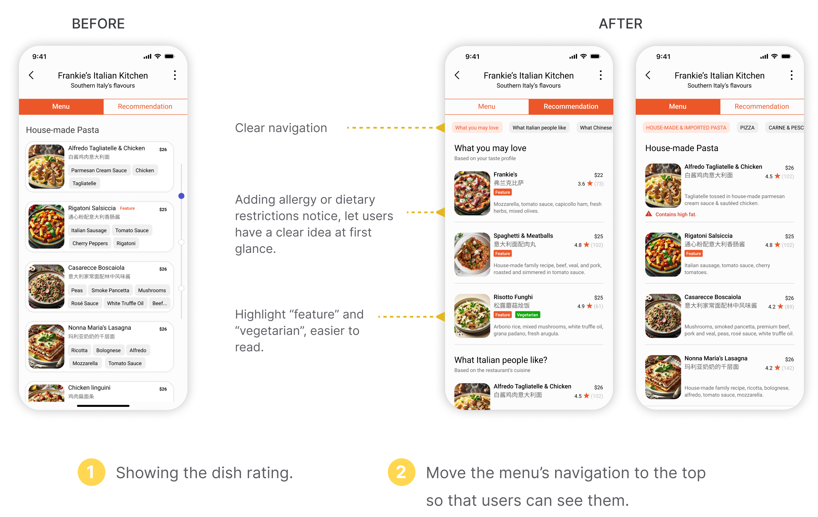
Users expected menu cards to provide key information, including ratings and dietary compatibility, at a glance. The current dietary alert symbol proved ineffective, with users requesting more detail on conflicting ingredients. Consequently, I redesigned the menu cards to improve readability and highlight essential information based on user needs.
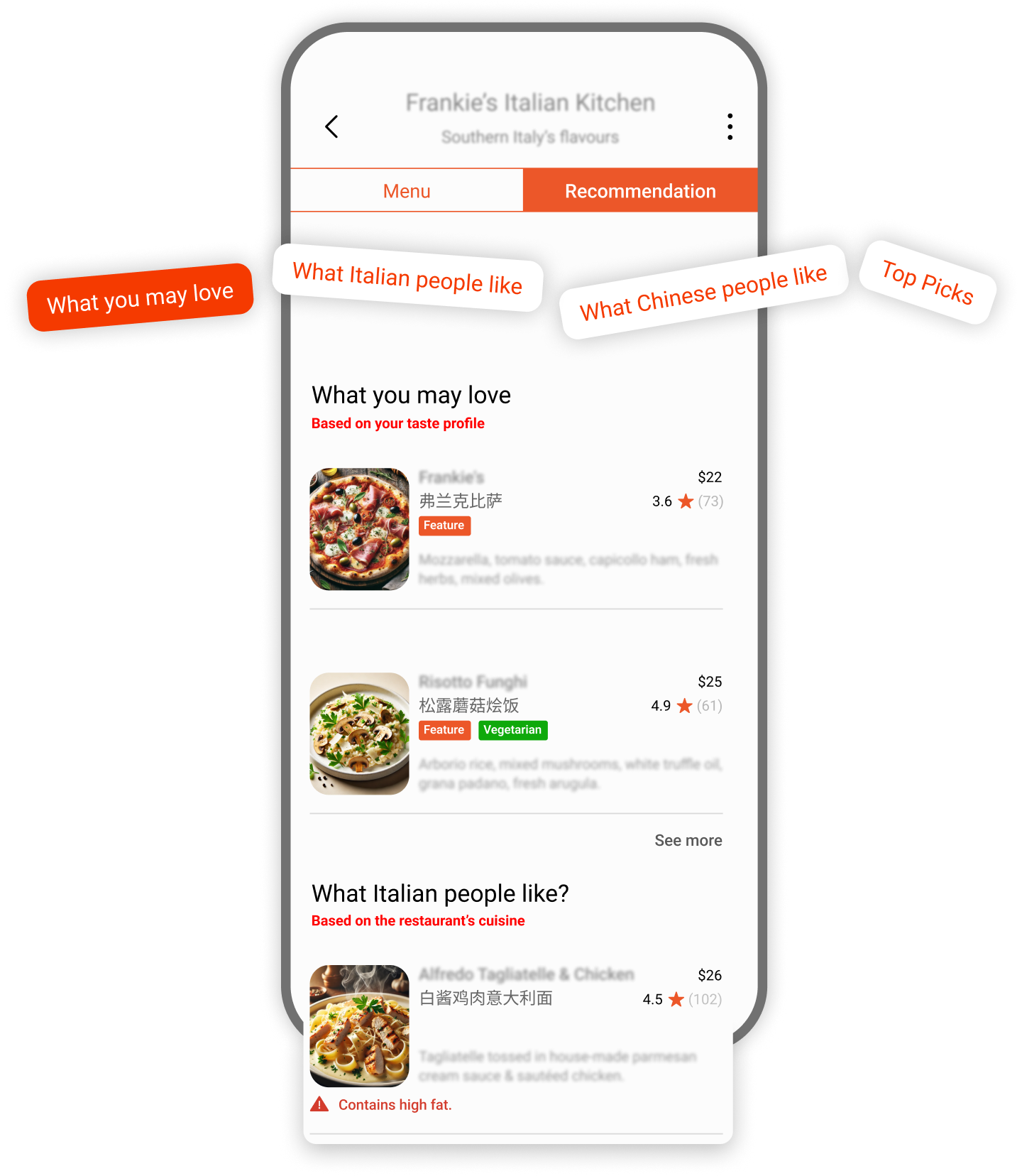
Our initial design focused on delivering immediate recommendations to users by AI-driven. During user testing, user feedback on this feature was distinctly polarized. Some users found it helpful for quickly narrowing down menu options and speeding up the ordering process, while others felt that the labels “challenge” and “highly recommended” were too definitive and expressed doubt in the AI’s decision-making.
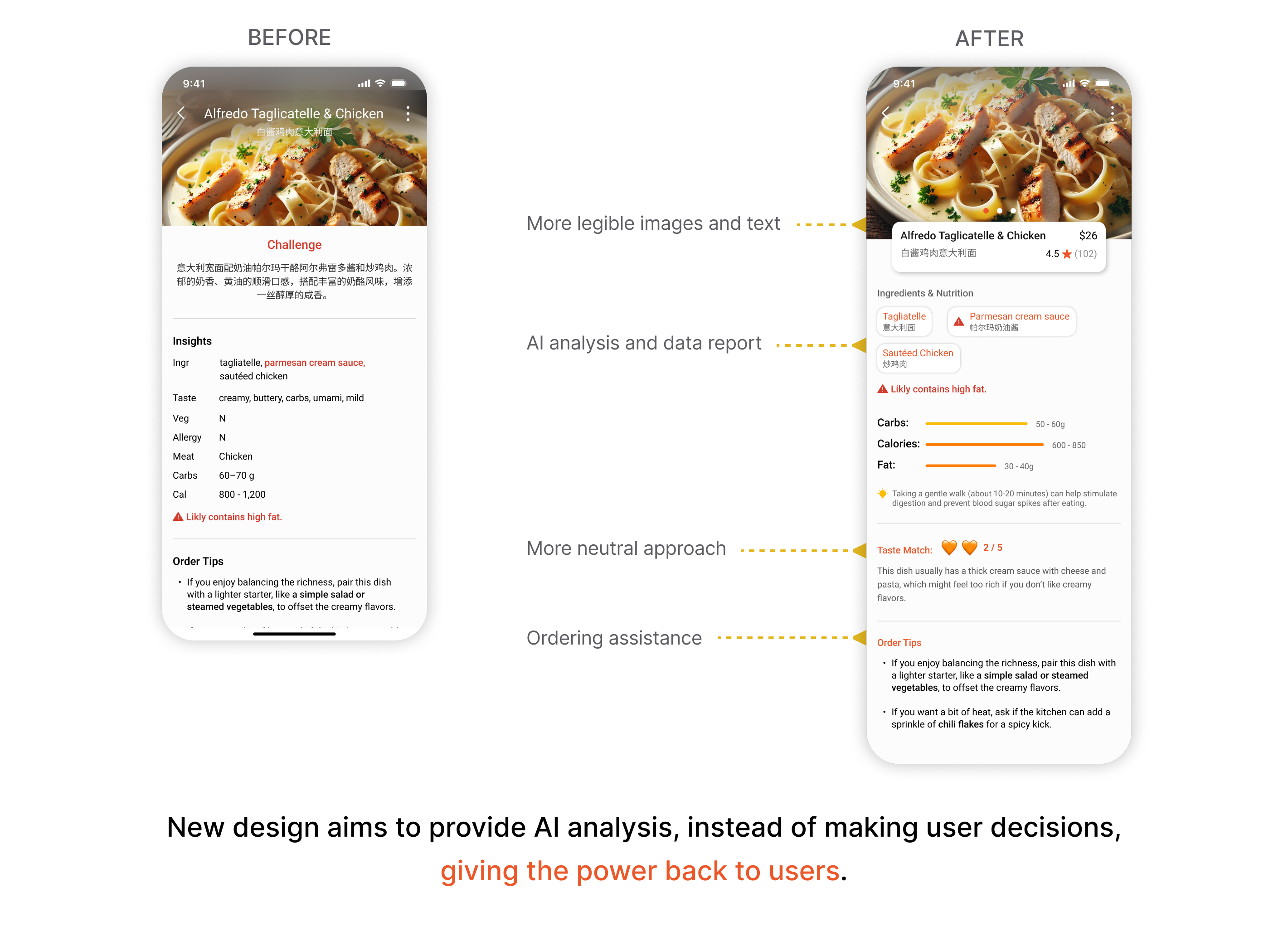
To address user feedback, I redesigned the page layout to maintain AI recommendations but present them in a more neutral manner. Star ratings represent recommendations instead of text labels. Allergy and dietary restriction information is now integrated into the ingredient list to avoid redundancy. I also simplified the AI recommendation explanations for easier reading by non-native English speakers.
.png)
During user testing, when participants exited the menu page and returned to the homepage, most questioned whether they needed to rescan the menu. A "menu history" function within the settings, was not intuitive for users. They required a more obvious way to prevent navigation issues.
I redesigned the menu history feature as a temporary access on the homepage. For two hours after exiting the menu page, users will be prompted with the option to return to the menu they were previously viewing.
.png)
Here's the latest prototype with some of my updated changes. Further changes to the design based on user feedback will be posted soon.
While Palateer currently functions as intended for our MVP, we anticipate the future growth by fostering a strong user community. The challenge lies in motivating users to open the app and review their dishes after their dining experience, when they may have little incentive to do so.
.png)
Tracking user orders is difficult since they don't order directly through the app, making it challenging to solicit reviews or offer personalized recommendations. Gamification presents a potential solution. Future research will investigate the effectiveness of dish stickers, review badges, and leaderboards in motivating users to log and review their meals.
Users can currently filter reviews by ethnic background and cuisine. However, user requests highlighted the need for additional filtering options, including by rating (e.g., 1-star or 5-star reviews) and sorting by criteria such as recency and helpfulness. Further research will determine which filters and sorting methods are most valuable.
The current prototype, designed for a Chinese-speaking user, highlights a potential scalability issue. While this demonstrates functionality, the generally shorter length of Chinese words compared to English. Languages with longer words, such as Ukrainian, could significantly impact the app's visual design. Further development of this project would necessitate addressing internationalization as a key UI design challenge.

.png)